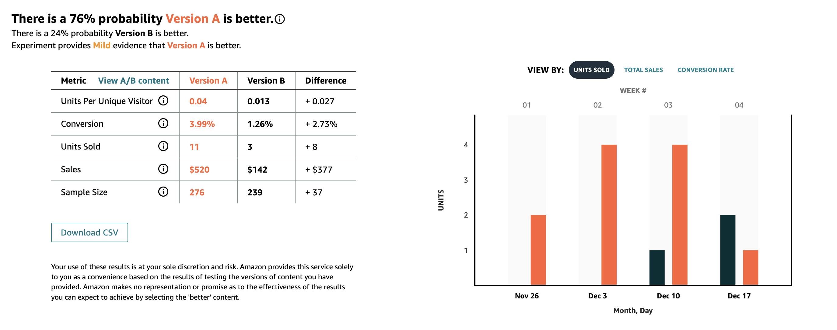
To enhance the product’s appeal and overall user experience, we implemented several key updates in our A+ Content. These changes focused on improving the layout by adding pops of color and creating a cohesive, visually pleasing design. The updated layout was aimed at drawing more attention to the product and making the listing easier to navigate for potential customers. Additionally, the new design elements were intended to create a more professional and polished presentation, setting the product apart from competitors.
Another significant improvement was the strategic highlighting of the product’s key benefits. By clearly showcasing the advantages and unique features, we aimed to better communicate the product’s value to shoppers. This approach was expected to strengthen the product’s appeal and encourage more users to convert by providing them with a clearer understanding of what they would gain from the purchase.
The split test results showed that these updates led to a 2.73% improvement in conversion rate, increasing from 1.26% in Version B to 3.99% in Version A. Additionally, units sold in Version A rose to 11 compared to just 3 in Version B, resulting in a difference of 8 units. The improved performance translated into a $377 increase in total sales, with Version A generating $520 compared to $142 in Version B. These results demonstrate how design and benefit-focused messaging can effectively enhance product visibility and drive better sales outcomes.

